Evolving a Trusted Brand for a Changing World
FPC – Brand Strategy & Identity Evolution.
Strategic Positioning | Narrative & Brand Architecture | Design & Creative Direction
The challenge
After more than 40 years of growth and loyal relationships, FPC’s visual identity had been outgrown..
As a Chartered Financial Planning firm renowned for clarity, continuity, and care, the brand no longer reflected the modern, people-centred business it had become. The challenge: to refresh its identity while preserving the calm assurance and humanity that define it.
The approach
Founded in 1982 and owner-managed to this day, FPC was among the first independent financial planning firms in the UK – helping shape a profession once driven by sales into one built on trust.
Chartered Financial Planners since 2008, FPC continues to raise standards by supporting every team member to achieve professional accreditation and by giving back through the FPC Foundation, which funds grassroots initiatives in financial wellbeing, education, and mental health.
Together, Fernly and NonConform explored FPC’s heritage, purpose, and partnerships to uncover what makes it distinctive: its people, its relationships, and its quiet integrity.
We defined how the business had evolved:
from pioneering firm to holistic partner
from local recognition to regional influence
from client service to enduring partnership
From this came the idea of the financial landscape – a creative concept expressing how FPC helps clients see, understand, and navigate their world with clarity and confidence.
The collaboration
Building on this shared concept, Fernly and NonConform worked in partnership to align strategy, language, and design around a single vision.
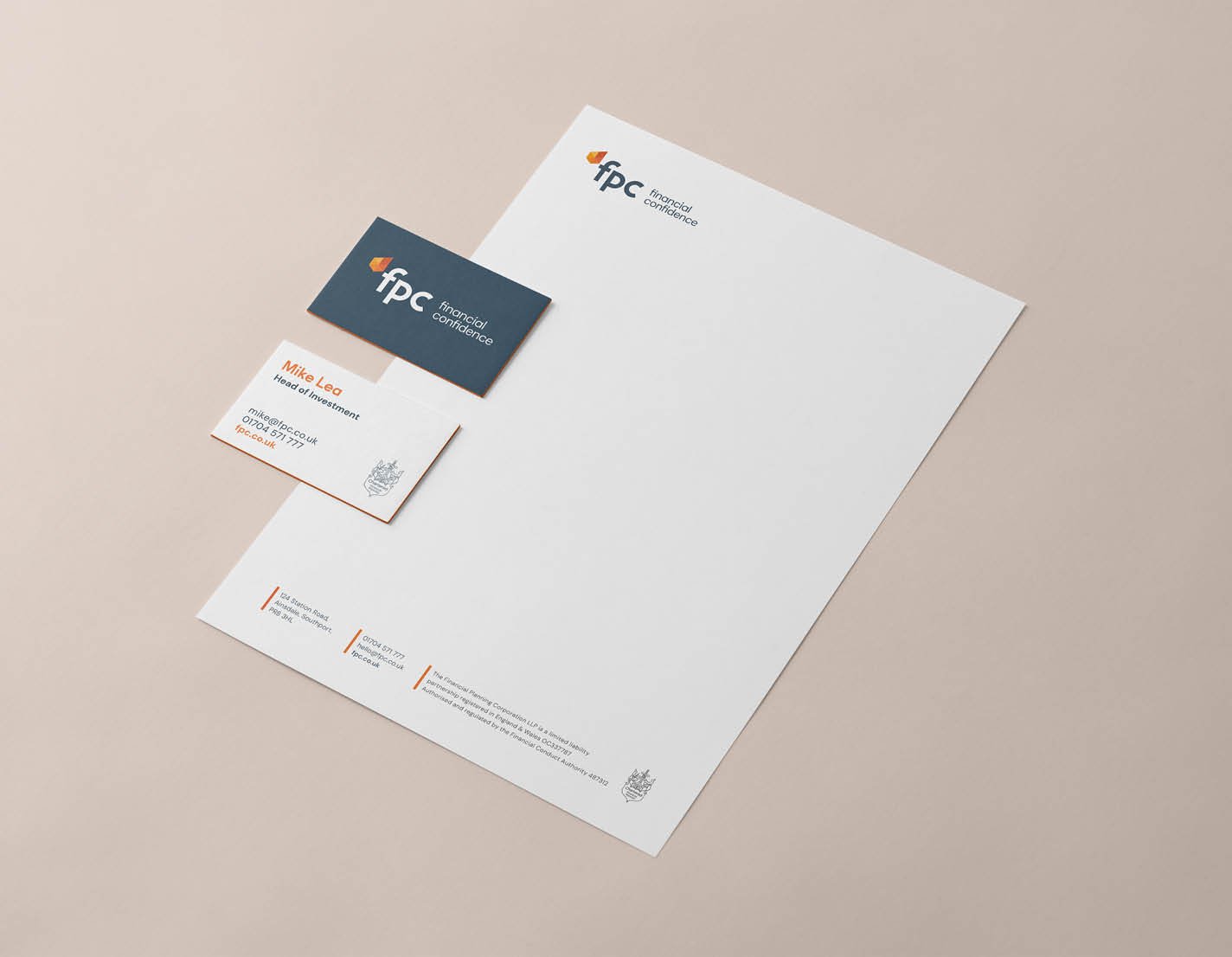
A key shift was simplifying the name: now simply FPC – trusted, familiar, confident.
The visual and verbal identities evolved to centre on one promise: financial confidence.
Horizon-based imagery drawn from local coastlines connected the brand to its place and purpose, while NonConform developed bespoke typography and design principles that unified the experience across digital and print.
The result
A brand that feels contemporary yet rooted – confident, calm, unmistakably human.
The outcome
The evolved identity captures FPC’s essence – a rare blend of clarity, continuity, and care delivered by a team deeply committed to clients and community.
"This evolution brings greater clarity, consistency, and connection across everything we do – helping us communicate the same calm assurance that underpins our advice." - Moira O'Shaughnessy, Managing Partner, FPC
For Fernly and Nonconform, this project represents meaningful brand evolution – not change for its own sake, but a confident expression of people, purpose, and place, crafted with care.
Contact us
Let’s talk about clarity, credibility, and connection for your business


